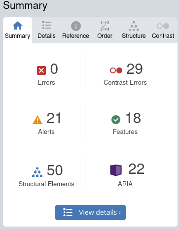
The results of the WAVE Accessibility showed no errors but indicated 29 contrast issues, 21 alerts, and several ARIA and structural elements that could use improvement. Most of these issues were related to the platform’s default settings, like the low contrast between text and background. I was surprised to see how much the default color scheme impacted accessibility, especially in ways I hadn’t thought about before. I think I should update my blog to improve the contrast to make it easier for everyone to read.

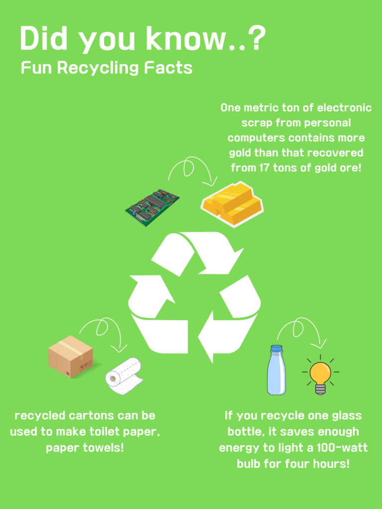
My Canva infographic, called “Fun Recycling Facts,” was made to present information in a fun and visually appealing way to raise awareness about recycling. Here’s a breakdown of the design principles I used for this infographic:
Contrast: I used bold white text on a bright green background to make the information stand out clearly. Each fact was paired with a colorful illustration, which helps break up the content and draw attention to each point.
Alignment: I kept the text and images centrally aligned to create a clean and balanced look. This makes it easy for the audience to follow along and understand the information.
Hierarchy: The main title, “Did you know..? Fun Recycling Facts,” was the largest text to make it clear that it’s the primary message. The facts were in smaller font sizes to guide the reader’s attention from the headline to the details.
Proximity: I grouped the text closely with its matching image to help viewers quickly connect the information with the illustration. For example, the fact about electronic scrap containing gold was right next to a graphic of a circuit board and gold bars.
Balance: I arranged the elements evenly across the infographic to keep everything balanced. The recycling symbol was placed at the center, with related facts around it, which creates a nice visual balance.
Repetition: I used the same green background color and consistent fonts throughout the infographic. This repetition helps tie the whole design together.
Color: I kept the color palette simple, using green, white, and a few bright colors for the images. This keeps the design consistent and relevant to the recycling theme.
Reflection: This project helped me see how small design choices, like color contrast, can make a big difference for accessibility. Even though the content was engaging, I learned that focusing on accessibility features, like proper contrast and grouping elements thoughtfully, is important to make sure more people can benefit from it. Moving forward, I plan to pay more attention to these aspects to make my designs better for everyone.
Creating the infographic was a fun experience, and I liked how easy Canva made it. To me, inclusive design means creating something that anyone can use and understand, regardless of their abilities. I wanted my infographic to be visually attractive and simple to grasp, and I think I achieved that by applying these design principles. Using clear fonts, simple illustrations, and limited colors helped make the design more inclusive. I also thought about how airports use symbols that are understood worldwide, and that inspired me to use easily recognizable images and keep the text simple.
Overall, this module really reinforced how important it is to think about inclusive design and accessibility in all kinds of media. It’s not just about adding visuals but making sure those visuals are useful for everyone.
This infographic is a fantastic example of accessible and engaging design! The use of bold white text on a bright green background enhances readability, and the colorful illustrations paired with each fact make the information visually appealing. The central recycling symbol provides a nice focal point, with facts radiating outward, creating balance and flow. The fun and surprising facts, like the gold content in electronic scrap and the energy saved from recycling a glass bottle, make recycling feel relevant and impactful. Overall, it’s clear that thought went into making this both informative and easy to understand. Great job!
Great work with the infographic! It was a simplistic and minimalistic design that presented the viewers with only intrinsic load without many distractions. I liked your reflection on the site’s base layout leading to multiple contrast errors, something I found to be true too. I liked your conclusion too as it properly summarizes the whole unit.
Wow! I love how you applied the design principles in your infographic, especially with the bold contrast and used universally recognizable images. The use of alignment, hierarchy, and repetition really ties it all together, making it accessible and engaging.
Your approach to inclusive design shows that even small changes can make a big difference in reaching more people. Well done!!